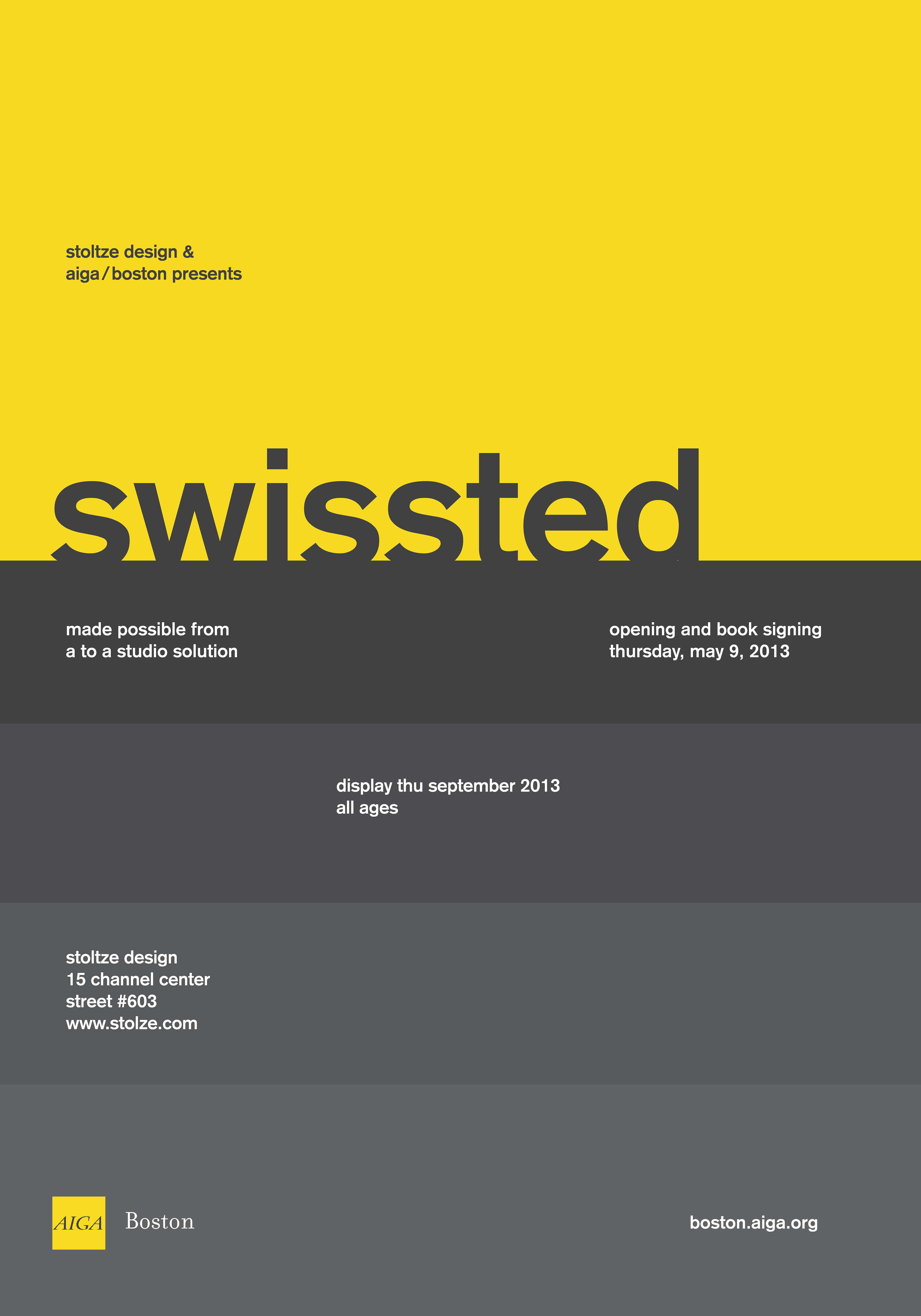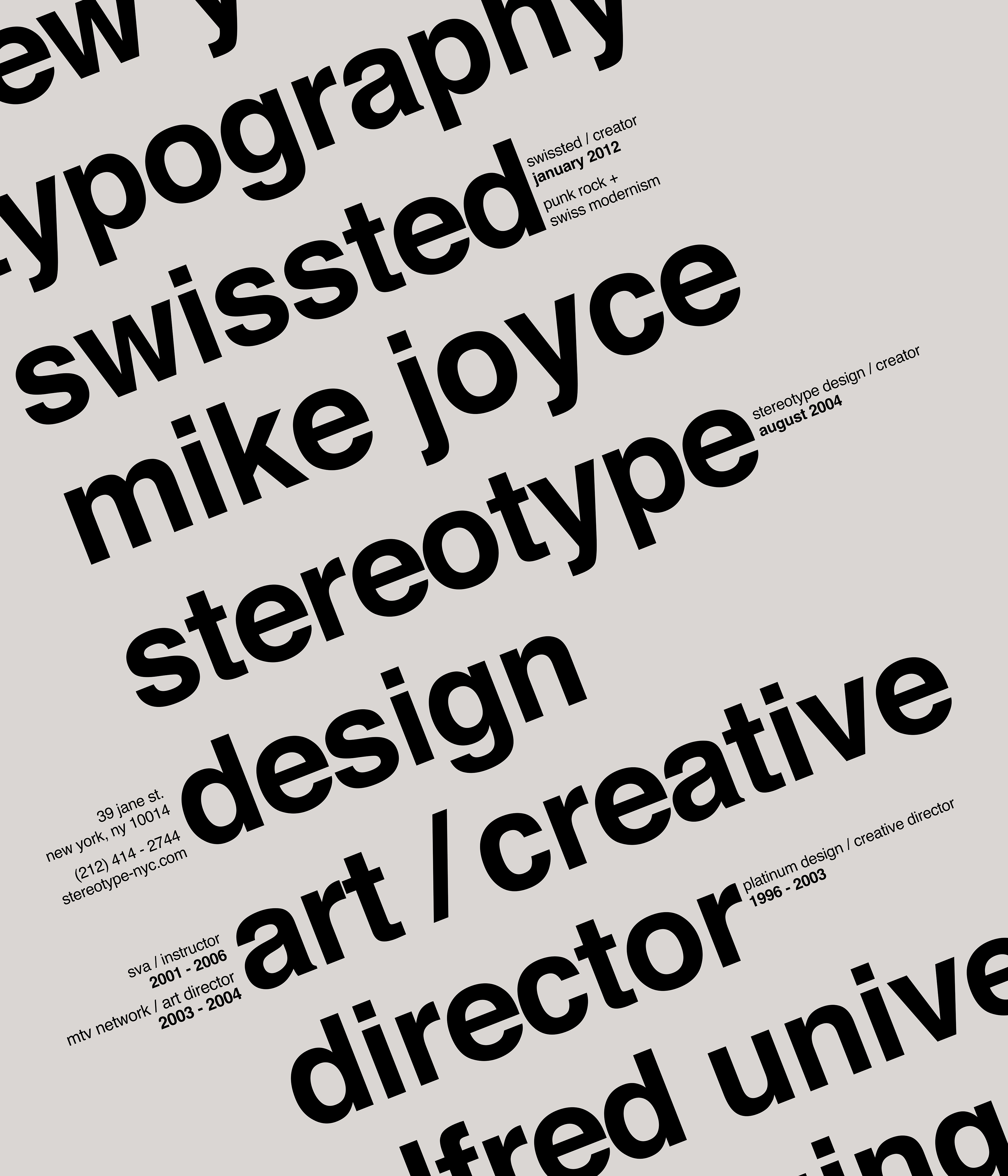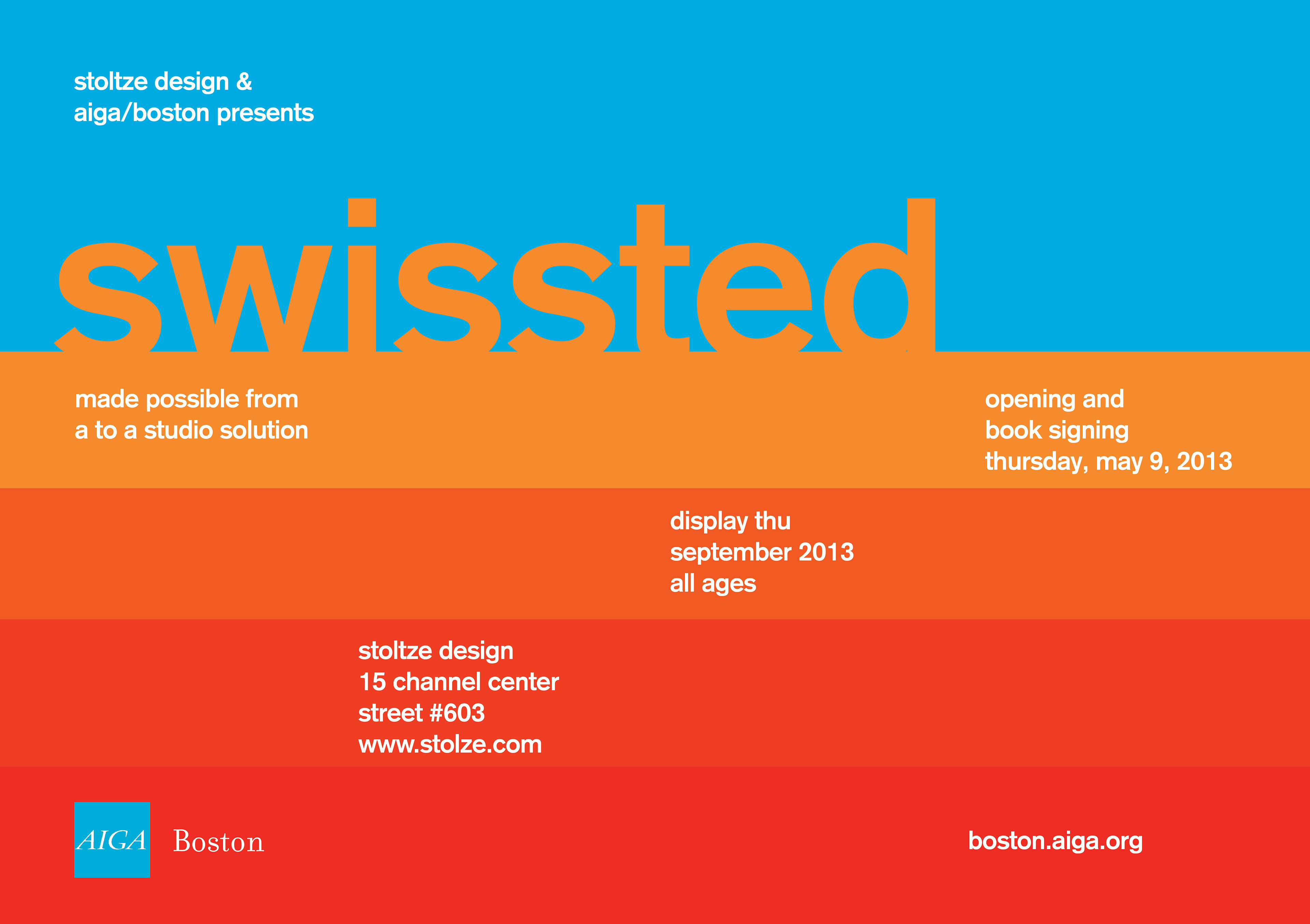


The original college assignment for Typography class was to recreate a poster of a Designer we adore and base the information on their lives’ work. Eventually, for my Advertisement class used AIGA as our fictitious clientele, we had to create a single advertisement. The catch was being able to reformat the advertisement in three various sizes for editorial material. Mike Joyce’s work introduced me to contemporary Swiss Modernism. His body of work had a huge impact on me and my creative direction. The advertisements and the design poster were composed to emulate his style.
