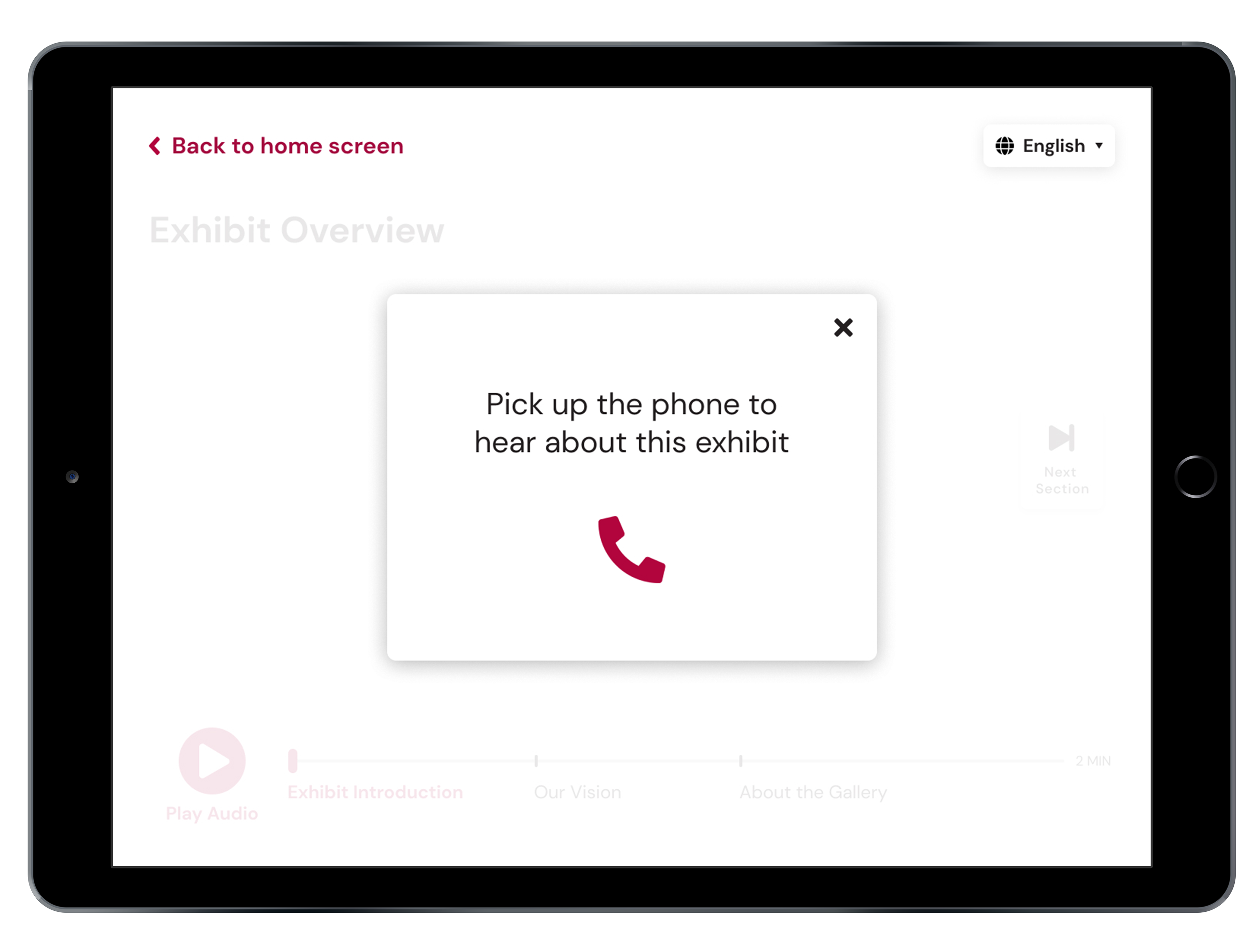
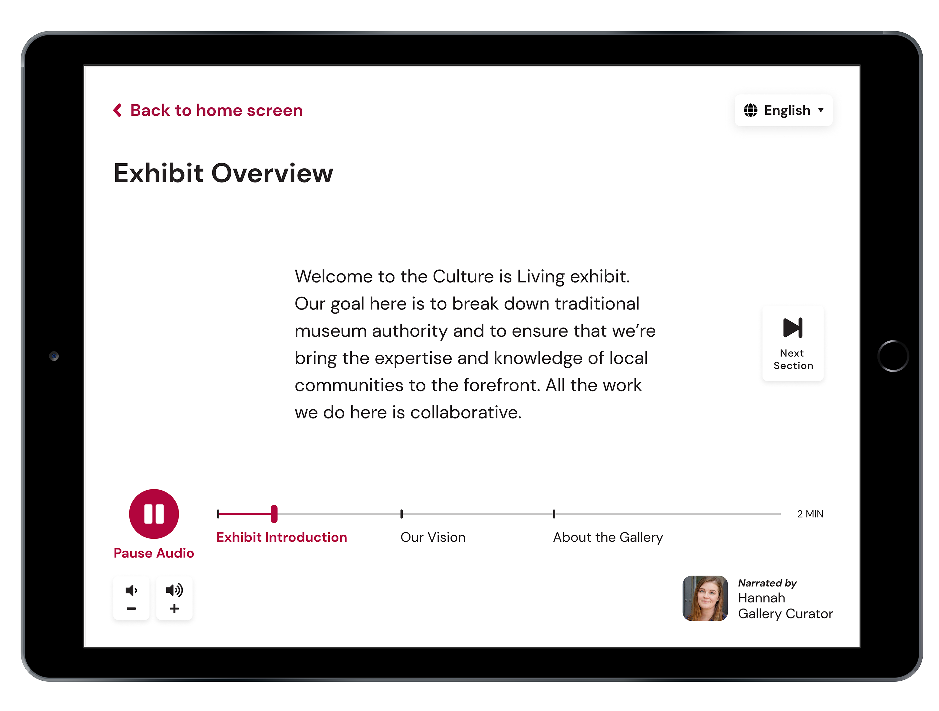
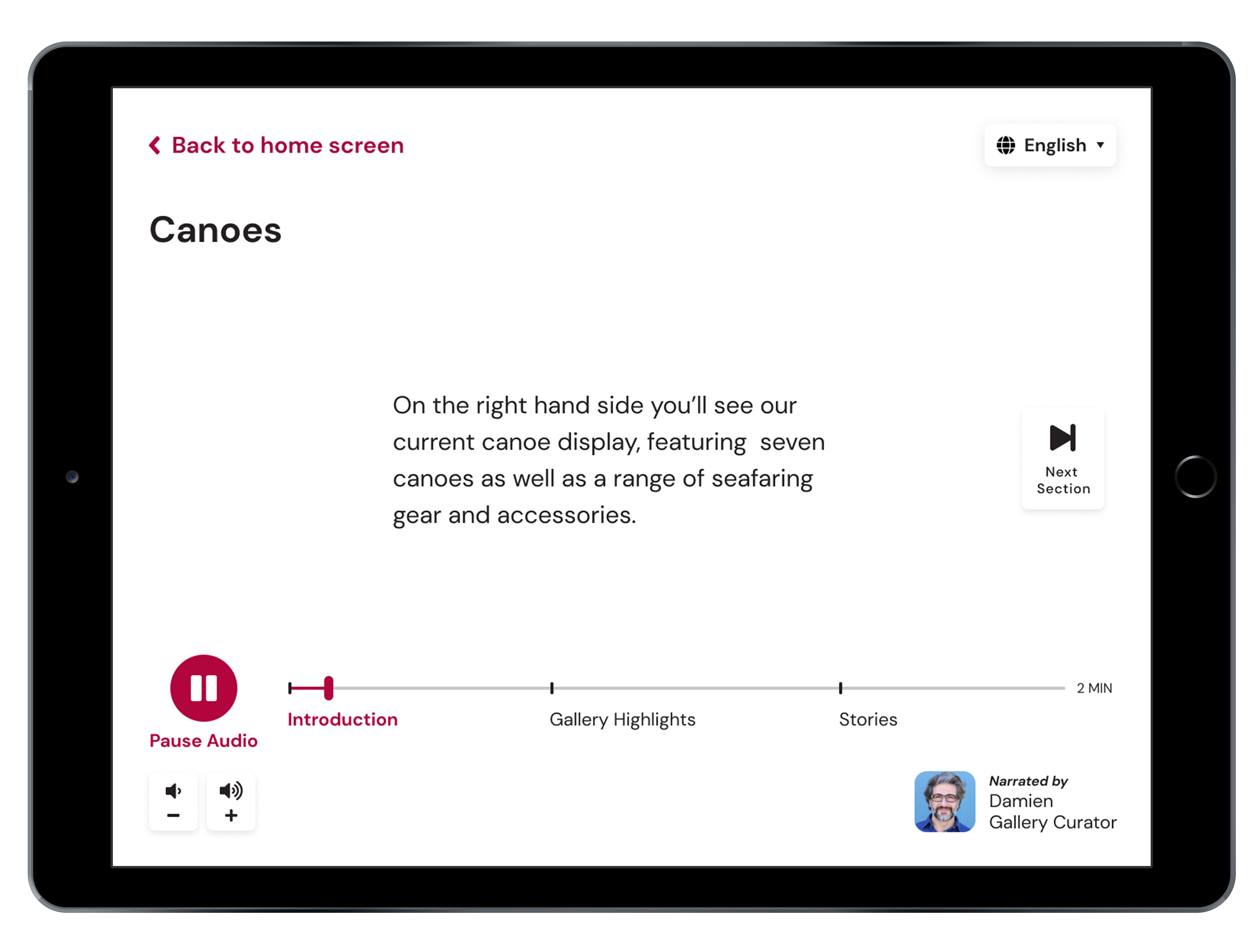
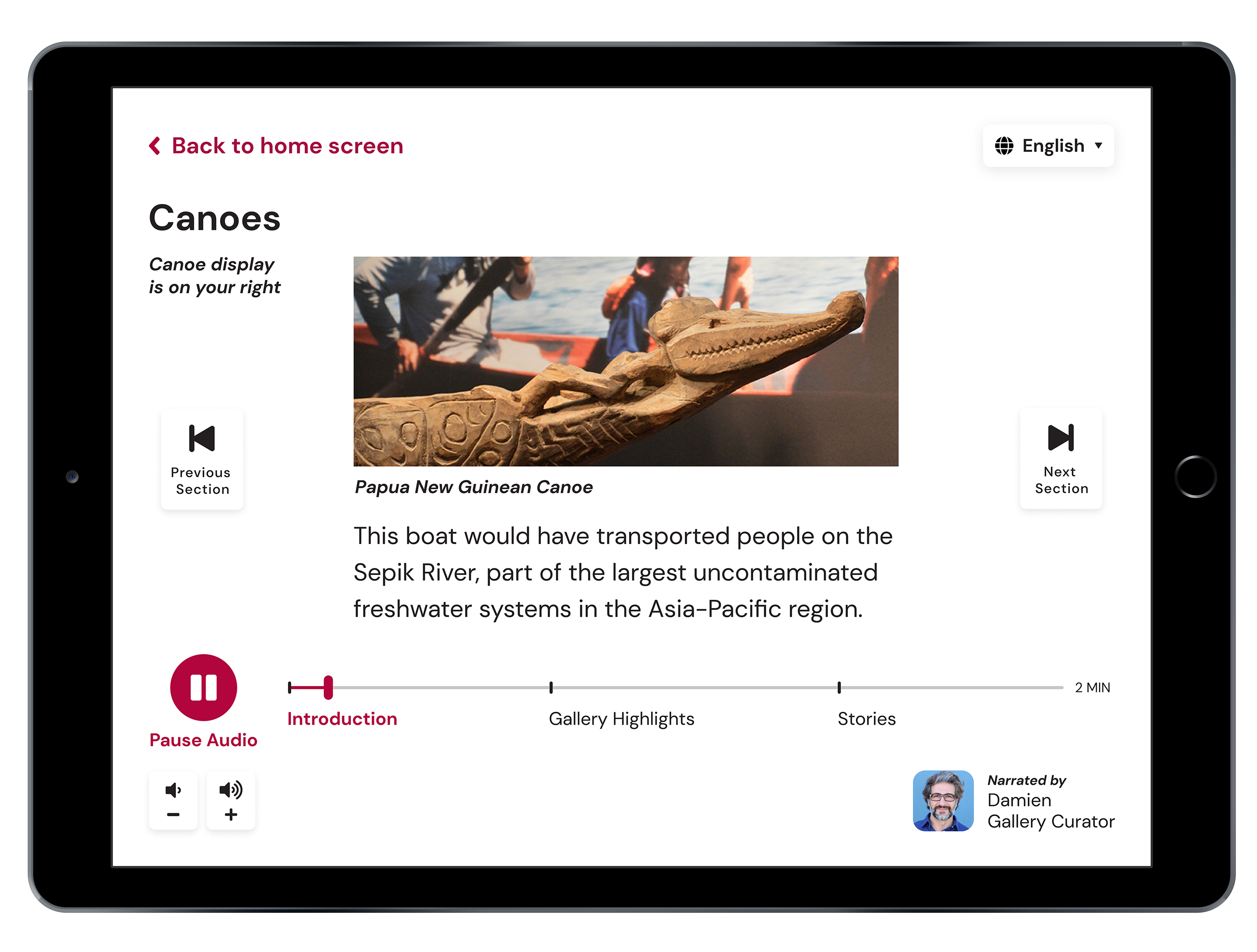
Concept mockup of our design response.
The Burke Museum Tablet Application
STATUS Winter 2020 – 6 weeks
PROJECT Museum Exhibit UX
PROJECT Museum Exhibit UX
MY ROLE User Research, UX/UI Design, Photograph Visuals, and Video
TEAM Amixa-Ray Calzado, Rachel DeNoble, Nadia Kaheil, & Clara Too
TEAM Amixa-Ray Calzado, Rachel DeNoble, Nadia Kaheil, & Clara Too
PROJECT OVERVIEW
We were assigned to develop an application that would accompany the newly renovated Burke Museum. Their new facility doors opened to the public in October 2019. We want to create an experience that will enhance and aid current exhibits at the Burke Museum.
—
We were assigned to develop an application that would accompany the newly renovated Burke Museum. Their new facility doors opened to the public in October 2019. We want to create an experience that will enhance and aid current exhibits at the Burke Museum.
—
VIDEO
Video presentation of our application and rational.
RESEARCH
We attended the Burke Museum twice, once during the weekday and again on the weekend. Surveying the broad age range of patrons that attend the museum—narrowed to the senior demographic. We noticed they were a frequent group in attendance. With their significant other or accompanying their kids and grandkids.
The following day we observed and interviewed seniors as they toured the museum. Taking note of how they interact with the front desk and staff members as needed. When any came to a pause in their self-exploration we would ask who would participate in an interview.
Seniors may experience an array of limitations. Ranging from vision, auditory, cognitive, or physical abilities. While we cannot address every barrier that a senior may have we narrowed in on our users and specific needs.
—
How might we improve the senior visitor experience at the Burke Museum?
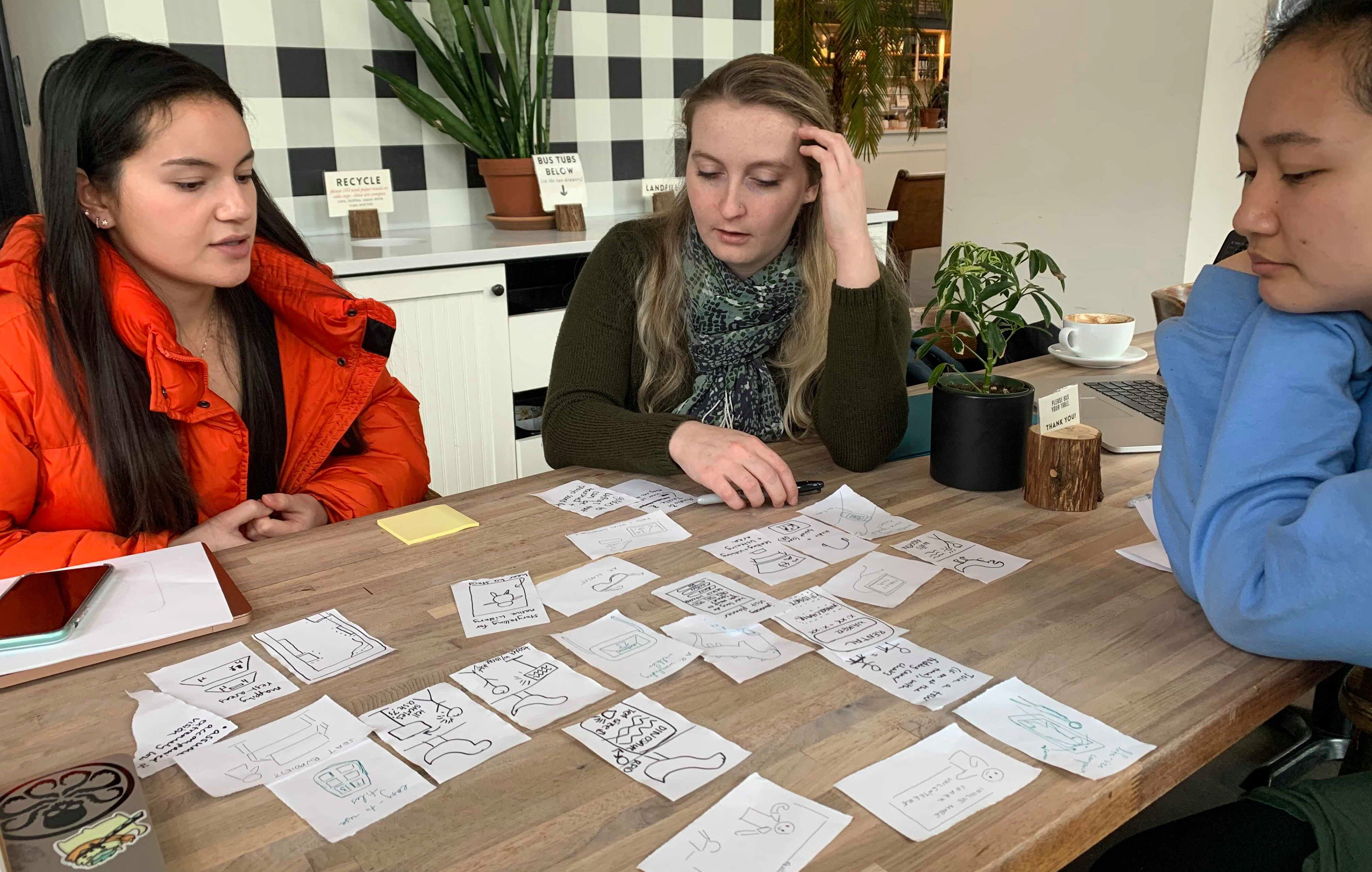
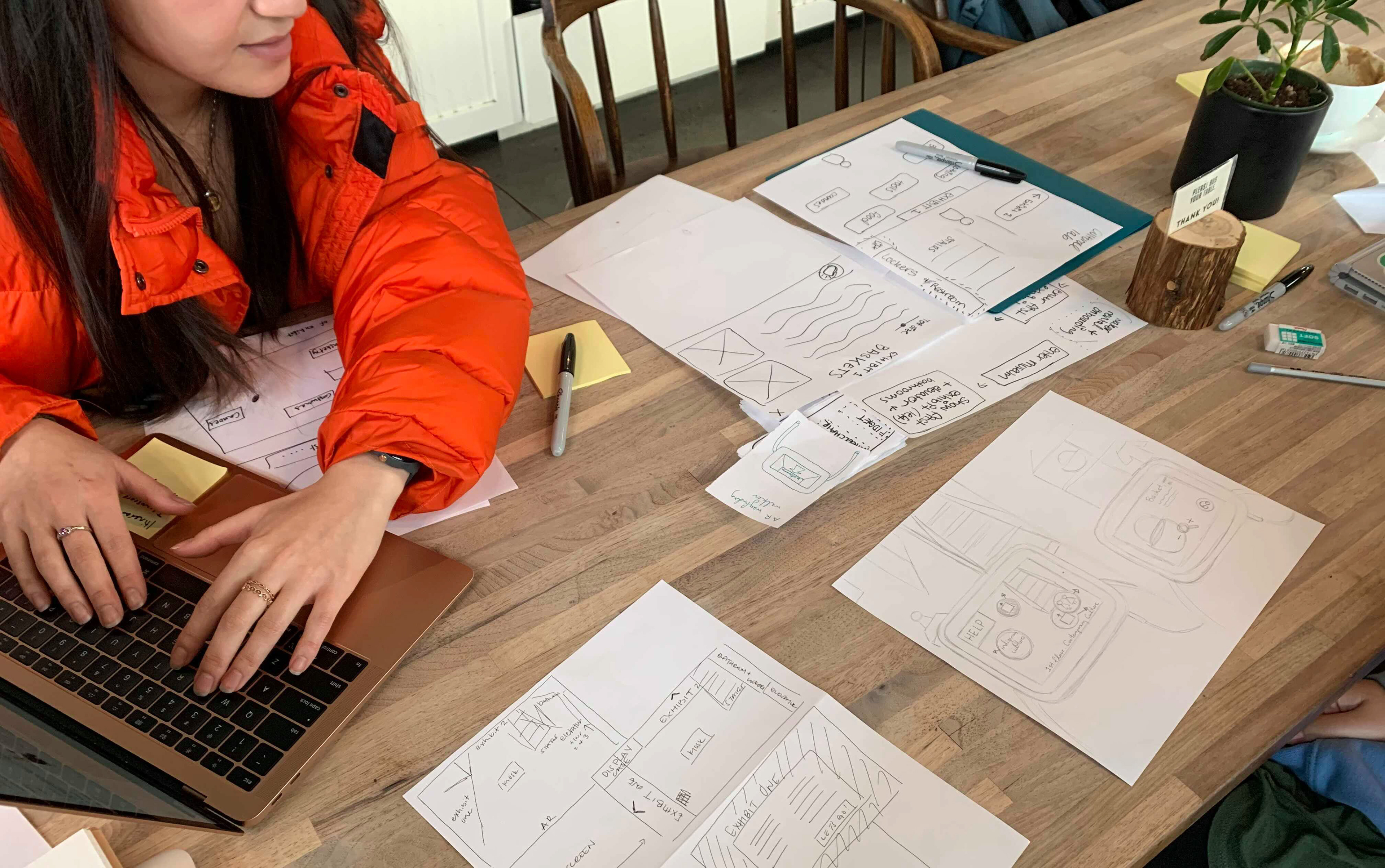
Ideation on how we would want to display our design response.
TAKEAWAY
We found that the Burke Museum can be difficult to navigate through. Especially for seniors with vision and or mobility impairments. We crafted a design response to ensure it fits within the context of the Burke Museum and fulfilling the W3C standards. To the public, this would enhance the experience for all visitors.
—
INSIGHTS
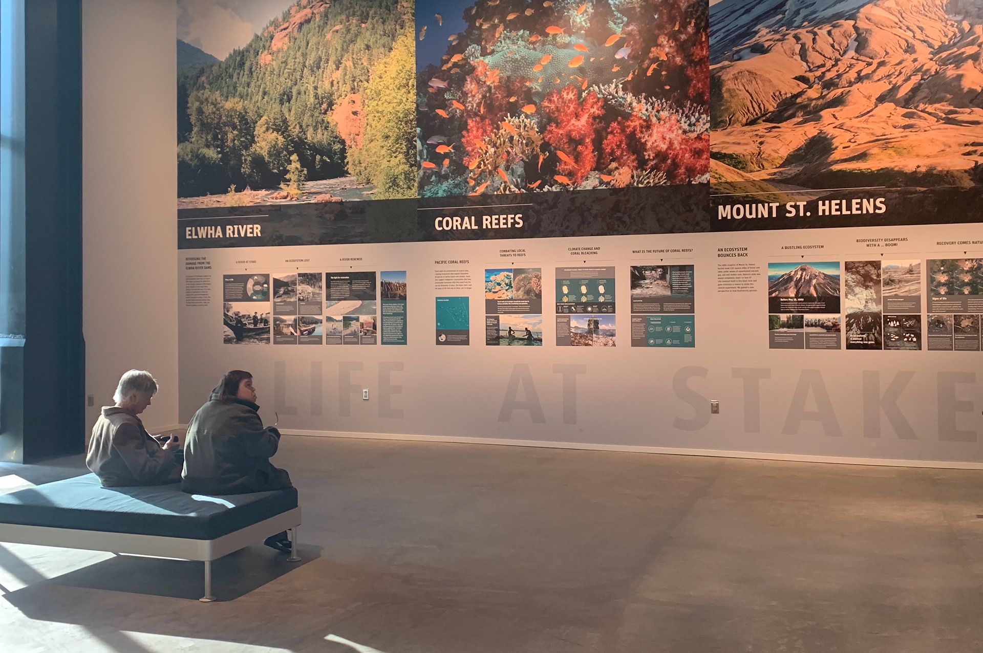
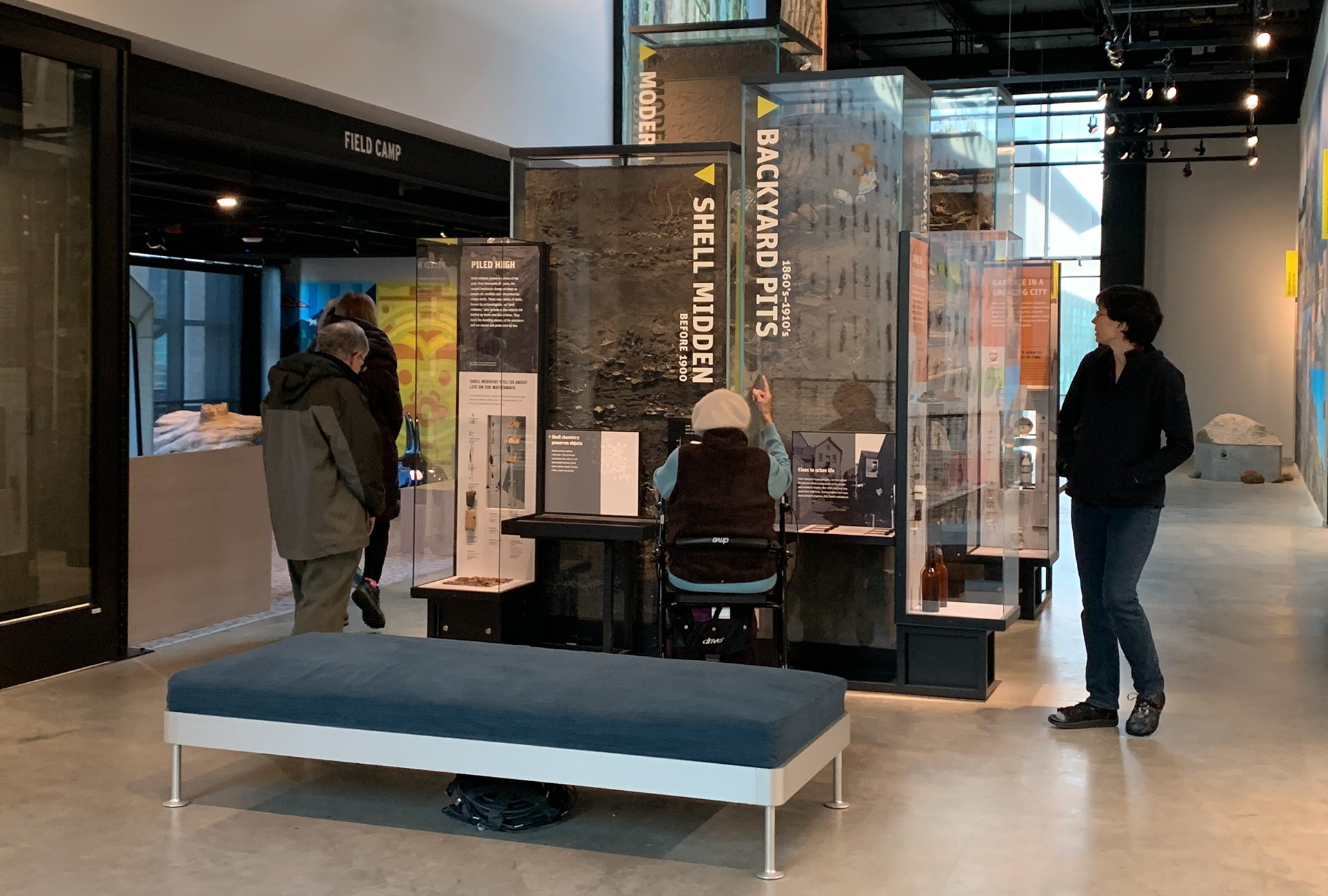
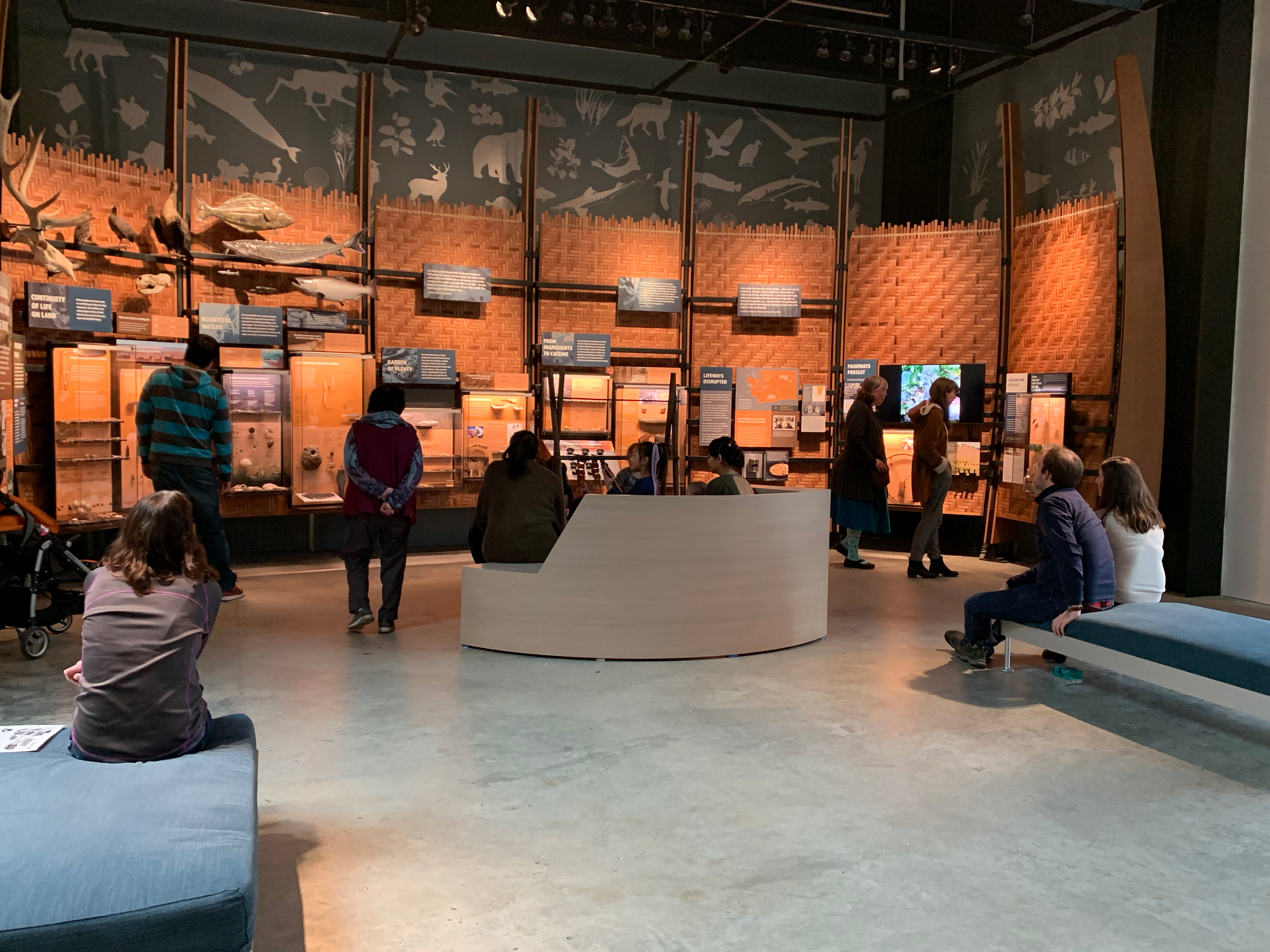
The current seating at the Burke Museum provides no back support as seniors will tend to slouch.
01. Senior visitors crave conversational interactions
We observed that seniors seemed to enjoy learning by conversing with the staff and sparking volunteers. We created an audio interaction based on the existing phone interactions that are used throughout the Burke exhibits.
02. Small text prevents seniors from being able to fully access museum content
Many seniors could not read the museum placards and signage due to the type size and unfavorable lighting conditions. Within our tablet application, we chose to use DM Sans as it has a large x-height to maximize legibility, and limit our text sizes and contrasts well above accessibility requirements.
Many seniors could not read the museum placards and signage due to the type size and unfavorable lighting conditions. Within our tablet application, we chose to use DM Sans as it has a large x-height to maximize legibility, and limit our text sizes and contrasts well above accessibility requirements.
03. Seating at the Burke Museum is unsuitable for many seniors
The seating that is available in the exhibits is too low for seniors with back and joint problems. Some knew they wouldn't be able to stand up again if they sat down. Easily noting how soft the couches were with no arm support. Our design response recommends an arm and backrest, as well as high seating for comfort.
Feedback on our original user flow design.
REFLECTION
It was fun working with students in the Human-Centered Design program. There are a lot of expertise differences in research design. Being able to bring unique attributes to the user interface and experience to the table. They helped in bringing our design response to the next level. We made plans to present our design to the director of the Burke Museum. But, COVID-19 had spread across the state of Washington and cut our design project to 6 weeks. It would have been an amazing opportunity had it panned out.
We would have loved to add more languages to our design. Tailor each seated area to each exhibit. And see the reoccurring seniors' and new patrons' feedback on our response.
